Brand identity
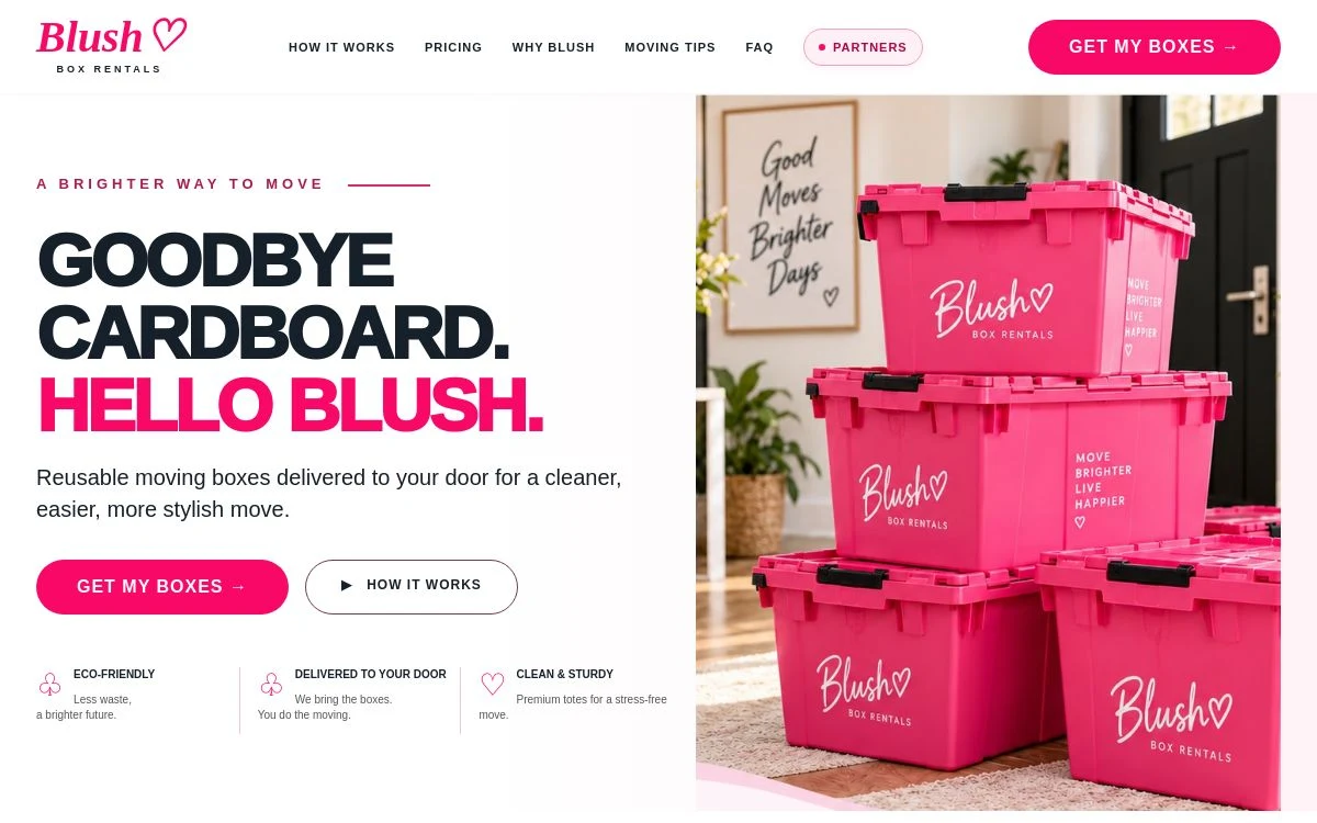
A pink-led visual direction and consistent brand presentation across the website.
BLUSH Box Rentals brings a bold visual identity to reusable moving boxes. The project brings the brand and its service information together so visitors can understand what the business offers and explore the rental options for their move.
The brief combined two needs: build a memorable identity and explain a practical service. Visitors need to understand the boxes, the rental options and the area served. The visual style needed to feel distinctive while keeping those everyday questions easy to answer.
We built the presentation around pink, a clear brand name and the “Move Brighter” message. Product imagery gives the service a concrete focus. The website separates the introduction, package information and practical questions so visitors can explore the offer in a sensible order.
A pink-led visual direction and consistent brand presentation across the website.
Reusable moving boxes are placed at the centre of the story so the service is clear from the start.
Package and service information organised to help visitors compare options for their move.
White Rock and South Surrey are named so visitors can understand the business’s local focus.
The delivered brand and website give BLUSH a consistent place to introduce the business, explain the reusable box service and present rental information. The project demonstrates how a recognisable visual identity can sit alongside clear, practical content.
For a local service business, design and useful information need to work together. A memorable colour palette helps establish recognition; clear packages and service details help people understand what they are looking at.
This case study describes our design work. No traffic, ranking, enquiry or sales results are claimed. The live website may change as the business develops.
Tell us about your business, the information your customers need and the website you have in mind. We’ll discuss a scope for your brand.